MusicRadar Verdict
You may think about touchAble and an iPad instead of a hardware controller. A compliment indeed.
Pros
- +
Way deep levels of control over everything in Live. Customisable interface, with lots of pretty colours. Integrated keyboard and drum pads for software instruments.
Cons
- -
Unreadable black-on-brown view buttons. Slightly cluttered layout.
MusicRadar's got your back
We're living in a world where anything over 99p is 'a lot' for an app, so anybody who's asking £8.99 for an iPad-only one that's totally dependent on another program to do its thing, better be pretty confident.
touchAble isn't the first iPad app to work with Ableton Live - there's also TouchOSC with the Livecontrol template, and of course, Griid Pro, but touchAble promises much deeper control over Live than any of the competition.
You need a Mac or PC, Live 8.1.5, the touchAble Server application, and of course touchAble itself on an iPad.
Setup involves the usual iPad WiFi voodoo - the key is to launch everything in the right order. Leave the server running if you plan to use touchAble's keyboard or drum pads.
Future thrill
It's a real geek-buzz when touchAble launches and shows your Live clip names and colours - even better when you start exploring and effect device parameters.
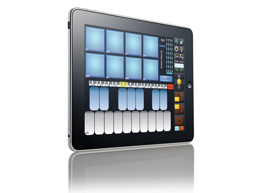
It all happens in one main 'view', toggling various display elements in full or half-screen, like clips, mixer and devices. You can also view a MIDI-style keyboard, and drum pads - very convenient for instrument control.
There are five velocity levels, and the keys or pads change colour to reflect this. What's not so cool, though, is the black-on-brown colour scheme used for those view buttons - it's totally unreadable, and we don't know how this got through to the final product.
Want all the hottest music and gear news, reviews, deals, features and more, direct to your inbox? Sign up here.
Like the Akai APC and the Novation Launchpad, touchAble provokes Live into displaying a red box on screen, highlighting the clips under your control. This box will be either 8x15, or 8x7, depending on whether you're in full-screen or half-screen view.
A navigation 'cross' scrolls through tracks and scenes in single steps, or blocks of eight - which doesn't relate very well to the x7 or x15 display!
There's a control panel where you can manipulate clip length, loop length and position, and pitch - very nice. The mixer shows output metering, and control over up to four sends while a separate toggle area deals with solo, mute, and monitor.
touchAble keeps its promise - you can dig deep, right into device parameters for instruments and effects. If you have two iPads, or a buddy with one, you can set them up to control the same set.
Things change fast in app-world, but at the moment, this is the deepest iPad-Live relationship you can get.
Information overload?
There are issues, though. For serious use, touchAble needs to be decluttered - the iPad screen is big, but not big enough for all of this, and that black on brown text has to go.
Using a touchscreen isn't a tactile experience, so the control it offers has to give you something extra somehow - most of the things you'll be doing with touchAble, you might as well do with your computer's trackpad - if you're not making the most of multi-touch, then why bother? Live's Session View interface is a design classic, and anything that takes you away from that better be worth the trouble.
But, we don't want to bash it too hard - at the moment, nothing comes close to touchAble for its intended task. So, is it worth buying an iPad just so you can run touchAble? No. But if you have an iPad already, then this is a must-have app even if you just dabble in Ableton Live.

Martin Delaney was one of the UK’s first Ableton Certified Trainers. He’s taught Ableton Live (and Logic Pro) to every type of student, ranging from school kids to psychiatric patients to DJs and composers. In 2004 he designed the Kenton Killamix Mini MIDI controller, which has been used by Underworld, Carl Craig, and others. He’s written four books and many magazine reviews, tutorials, and interviews, on the subject of music technology. Martin has his own ambient music project, and plays bass for The Witch Of Brussels.
