MusicRadar Verdict
It narrows the gap between the software and hardware, bringing a more tactile/integrated experience.
Pros
- +
Innovative. Good price. Full of features.
Cons
- -
Very little.
MusicRadar's got your back
Akai MPC Touch
Akai MPC Touch
Four years have passed since we reviewed the still-flagship MPC Renaissance and the first version of the MPC computer software.
Since then we have seen the new line of controller plus software MPCs evolve into a whole range of MPC-badged products including the entry-level MPC Element/Essentials and the midrange MPC Studio.
While the original self-contained and standalone MPCs were labelled MIDI Production Centres, with the launch of the Renaissance, Akai changed the name to Music Production Controller.
Fast-forward to 2016 and MPC now stands for Music Production Centre - this is an important change. Whereas the Renaissance, Studio and Element felt like controllers due to their small screens, Akai has seemingly been working hard to minimise the user's reliance on the computer screen.
Much like the Advance controllers and VIP software we recently reviewed, the MPC Touch has a specific remit: it has been designed so it feels like a standalone unit, even though it relies on a Mac/PC to host its brain - the MPC software.
"The Touch really does feel more like a standalone unit; it's easy to forget you're tethered to a computer."
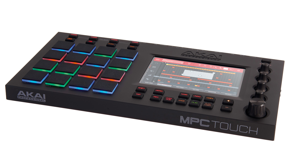
The Touch controller certainly has an understated industrial/functional elegance about it. While the top and sides are made from textured black plastic, the chassis/back is red metal and it all feels reassuringly solid and stable (and weighty) with grippy non-slip feet.
For travelling, the footprint is fairly large (and there's no battery power) but it should fit in a larger backpack - currently there's no dedicated case. MPC Touch connects to your computer via USB (though it requires you to plug in the external wall wart as the screen draws too much current for buss power) and it's designed to reside on your desktop.
It can be used flat or you can attach the included two-position stand which tilts the unit upwards - either towards, or away from you.
Getting hands-on
For anyone who's used to an original (or the newer MPCs), the layout/controls will all feel familiar and you'll be flying about the interface quickly. On the left of the front panel you'll find the famous 16 rubber pads (velocity and pressure sensitive) and they're super-sensitive, registering even the slightest touch.
We think their placement on the left works very well in conjunction with the screen and other controls - our only wish is that they were a little softer.
Like the other new MPCs, the pads light up in different colours to denote velocity and different modes/functions and colours can now be fully user-configured too. Above the pads you'll find pad bank buttons which select from the eight available pad banks (A to H).
All 22 function buttons on the Touch are made from black rubber (like the pads) and they feel good quality. The buttons are also backlit which is great for quickly finding things in dark environments.
Underneath the bank buttons is the Note Repeat button for inputting quantised notes quickly (with latch for hands-free note-repeating), a Half-Level button for half-level pad velocity, the standard 16 Levels button for accessing graduated functions across the 16 pads (velocity, filter level, etc) and an Erase button you hold down with any pad for erasing notes on the fly.
Moving to the right, under the screen are the Main and Menu buttons for accessing the homepage of the MPC software and accessing the main modes, plus record, overdub, stop,play and play-start buttons (self explanatory!), though unfortunately the bar/locate buttons are gone.
Further on, there's a Shift button for accessing secondary functions including note repeat latch, a new copy button for copying sounds/pads across banks, the browser for navigating/loading samples/ projects, track select, redo and delete.
"MPC software version 1.9 offers lots of power and has been massively improved since I reviewed it in 2012."
There's also + and - buttons for moving up and down levels in the software, though I wish the plus button moved up and the minus moved down in the browser rather than the current reversed implementation!
To the right of the screen are four touch-sensitive Q-link dials that map directly to specific functions depending on the selected mode and there's also a Q-link button that selects the column of Q links that's in focus for editing - four lights underneath show the column currently selected.
Finally, there's the essential jogwheel for rapid-value- changing/cursoring (it also clicks for selecting) and this feels great under the fingers but doesn't feel as solid as the Q-links.
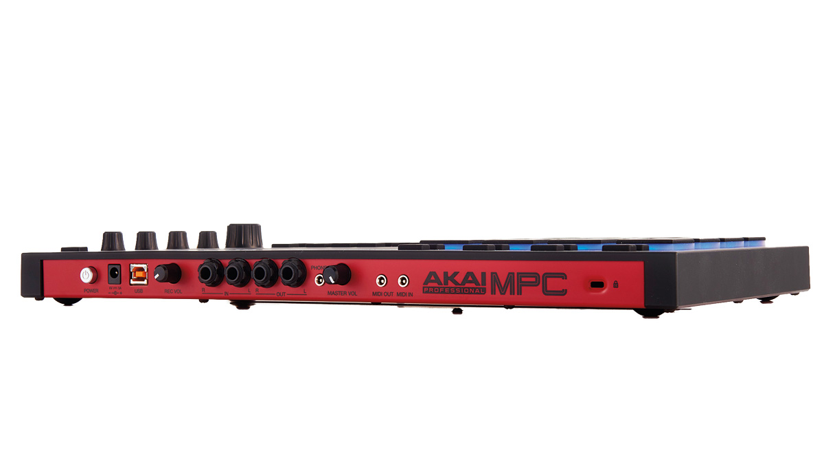
Around the back, as well as the wall wart power socket and USB for MIDI/ Audio/computer connection, there's a built-in audio interface (2-in/2-out, 44.1kHz, 24-bit) with full-sized jack inputs and a record level control for sampling directly into the MPC software, plus a pair of outputs if you want to process your beats using external processors.
There's also a minijack for headphones, a master volume control (which really should have made it to the front panel) and a pair of mini jacks for the MIDI breakout cables for connecting external MIDI gear to (and from) the Touch.
Magic touch
The most important feature of the Touch is its 7-inch high resolution full-colour, multi-touch screen. This is a first for an MPC and it's key to the Touch's solid integration with the MPC software.
It also means the Touch should stay future-proof as the MPC software evolves (in comparison, the Renaissance, Studio and Element are more restricted by their interfaces/small screens).
With most of us used to multi-touch screens on our smartphones, the gestures are all second nature and it feels like a natural evolution for the MPC.
Swiping, dragging, nudging, entering events, pinch/expand for zooming in/out, tapping to select and double-tapping for accessing drop-down menus (and functions that you don't want to inadvertently select) are all available with a shallow learning curve. The screen also keeps the front panel streamlined and fast to navigate which obviously speeds up workflow too.
The one caveat is that operation is now obviously very screen-centric (which some people might not like), but it's a small trade-off for the very narrow gap between the software and hardware.
We know many folks are still after a standalone new MPC (Akai actually showed a prototype recently of a standalone model using an embedded version of Windows to host the MPC software); but, while we wait for this potential new standalone flagship, the Touch really does feel more like a standalone unit and it's easy to forget you're tethered to a computer (well, until you move about at least!)
Importantly, the screen also reacts to touch snappily and predictably and the resolution is easy on the eyes (plus there are brightness buttons on the right side).
Handily, you can even use the Touch's screen as a desktop extender if you need a second or third screen for your computer (albeit a small one) and all functionality that's in the software can easily be selected and edited using the jog/enter wheel, Q-links and your fingers on the screen (or via your DAW/ mouse), depending on how you are working.
Two OS tweaks we'd like to see added are finger-driven corner-dragging for region/event length changes and more automation/event lanes displayed simultaneously - currently there's only a velocity lane.
All things considered, it's a much more involving/enjoyable experience using the Touch compared to its current brethren and the hardware to software integration is by far the best of any of the new MPC models too.
When you then consider the 20GB of good quality included content and the reasonable £499 price, the Touch is now the most desirable of the current MPC controllers. We're very impressed by the quality, innovation and features on offer.
With its latest free update, Ableton has finally turned Note into the app I always wanted it to be
Technically capable, but struggle to make your tunes sound musical? 5 simple music theory hacks to make your tracks stand out
"Despite its size, it delivers impressive audio quality and premium functions as well as featuring a good selection of inspired sounds": Roland GO:Piano 88PX review
