‘This is what Ableton Live should look like,’ says designer
Nenad Milosevic’s job application is a labour of love
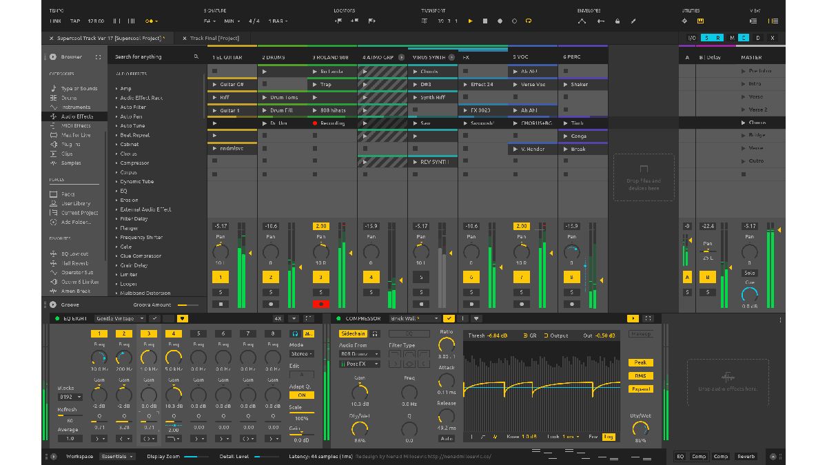
DAW users often make feature requests via forum posts and social media, but Nenad Milosevic has taken a rather different tack. A keen Ableton Live user, he’s taken it upon himself to redesign Ableton Live and share his thinking with the wider world.
He says: “This is my unsolicited redesign of Ableton Live. I did this to showcase my design skills to peers working at Ableton, where I would love to work as a designer.”
He goes on: “The idea here was to collect the information about what Live users thought needs improvement. Construct a hypothesis. Research it some more. Redesign it using my design intuition and skills. Test it to verify everything is going in the right direction. And finally, present the results.”
Having surveyed Live users about what they think could be done to improve the software, Nenad began his redesign by sketching out ideas, before mocking up what the ‘new Live’ would look like and asking users for their opinions.
All of Nenad’s thoughts and findings can be viewed on his website. It remains to be seen if any of his design elements will be implemented or if he’ll get the job that he desires, but you’ve got to admire his passion and dedication.
Get the MusicRadar Newsletter
Want all the hottest music and gear news, reviews, deals, features and more, direct to your inbox? Sign up here.



I’m the Deputy Editor of MusicRadar, having worked on the site since its launch in 2007. I previously spent eight years working on our sister magazine, Computer Music. I’ve been playing the piano, gigging in bands and failing to finish tracks at home for more than 30 years, 24 of which I’ve also spent writing about music and the ever-changing technology used to make it.
Most Popular


