Max/MSP diary part 5: the evolution of a patch
From ugly duckling to, err… magnificent swan
The most surprising thing about learning to use Max/MSP is that the more I practice, the better I get.
You may think that's a stupid, sarcastic comment but, as I slowly progress through the tutorials and mess around with my own patches, I find myself genuinely astounded at how quickly everything falls into place.
Sure, there are problems here and there and solving them often involves a fair amount of brain power, but you get a real sense of progress from doing so.
Over the last few days, I've been improving the patch I made for my previous blog - a very basic, dual-oscillator synth controlled by an X/Y pad for the mouse. The patch was lovingly dubbed (somewhat inaccurately, seeing as it's nothing like a Theremin) Rubbish Theremin. As you might be able to guess from the name, it had a few problems.
Here's the original:
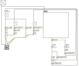
You may remember I had a problem with the two oscillators (one sine wave and one sawtooth wave) and phase cancellation. So, borrowing from a helpful chap called Chris Muir (from the Cycling '74 forums), I changed signal path of the sine wave generator so it would act as a slave to the sawtooth generator. This ensured the phase of the two devices would always be in sync. I also borrowed further from Mr Muir, who suggested converting mouse movements to a MIDI note value, in order to keep pitches in tune.
Subpatches
With phase and pitch problems dealt with, I set about 'pimping out' my patch. And thoroughly pimped it is too (note the oscilloscope). Here's Rubbish Theremin v2: Download patch (right-click and Save As...)
Get the MusicRadar Newsletter
Want all the hottest music and gear news, reviews, deals, features and more, direct to your inbox? Sign up here.
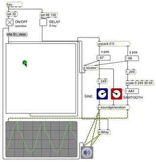
Aside from generally tidying things up and removing unnecessary objects, there are quite a few changes to version two of the synth.
The most obvious change is the addition of subpatches. Subpatches, as you might guess, are smaller patches within a larger patch. If you have a whole group of objects doing just one task, for example, you can group them all together and 'encapsulate' them. This means that instead of an unsightly array of objects and patch cables, you just have one neat box that looks exactly like any other Max object. Should you need to make changes, double-clicking the subpatch object will bring up its contents in a new window.
Not only do subpatches make things clearer visually, but they also make a large patch easier to mentally digest. Here's an example:
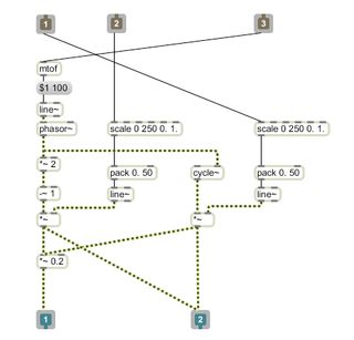
The image above is a subpatch from the new Theremin patch. It handles the sound generation of the patch: pitch comes in at the 'inlet' on the right, and the other two inlets receive information from faders which in turn control the crossfade between the two oscillators. Sound is then sent to the outlets (one at full volume for the oscilloscope and one quieter for speakers (and human ears). All-in-all, there are 16 pieces to the puzzle.
From the outside, however, there is just one: the subpatch object (below).

It makes such a difference. Once I'd built this subpatch, I could essentially forget about the sound generation part of the synth and concentrate on the bigger picture.
Further improvements
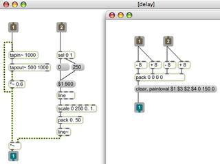
With the positively roaring success of my first subpatch, I decided to add another - this time a simple mouse locator that draws a green circle on the X/Y pad (above, right). I also decided to add a delay (as we all know, a Theremin just isn't a Theremin unless it's been put through some delay and used in a '40s sci-fi-horror film) in another subpatch (above, left). The delay itself wasn't actually too difficult - three objects to be precise - but interestingly, turning the delay on and off smoothly required eight. C'est la Max/MSP, I guess…
The final improvement was to allow sound on/off and delay on/off to be controlled by the computer keyboard.
Here's how it all sounds:
With delay:
Without delay:
Interfaces
Disappointingly, for all my tweaks and tidying, the patch still looked pretty awful. So delving back into the tutorials, I discovered the world of presentation mode.
Presentation mode allows you to build interfaces for your patch by hiding and showing objects, resizing and more. It's shallow I know, but interfaces make things so much more fun and rewarding. Now, not only had I got Max sounding remotely musical, but it was looking pretty good too:
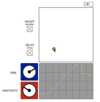
…and the recently-dumped old patch is consoled by its friends. "There there, the new patch isn't that good-looking. It's all just hair and makeup…"
Stay tuned for part 6.
Previous (Part 4: music and maths)




![Chris Hayes [left] wears a purple checked shirt and plays his 1957 Stratocaster in the studio; Michael J. Fox tears it up onstage as Marty McFly in the 1985 blockbuster Back To The Future.](https://cdn.mos.cms.futurecdn.net/nWZUSbFAwA6EqQdruLmXXh-840-80.jpg)


