Does Logic Pro X 10.3 make the MacBook Pro Touch Bar useful for musicians?
We find out if the latest version of Apple's DAW makes the Touch Bar make sense
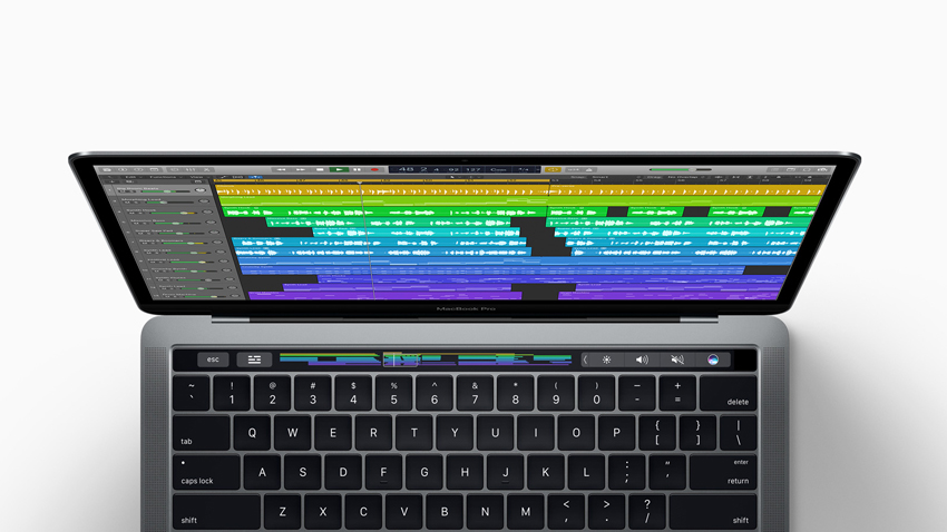
For many music-making early adopters of Apple's latest MacBook Pro, the introduction of Touch Bar support in Logic Pro X 10.3 is a make or break moment - the point at which it becomes clear whether Cupertino's controversial touchscreen compromise represents a bold new paradigm in serious software control or a technological white elephant.
Indeed, of all the possible applications for the Touch Bar, DAW and plugin manipulation are surely among the most potentially productive and relevant - hopefully like having a MIDI controller built right into your Mac.
The Touch Bar has six modes of operation in Logic Pro X 10.3, selected from a palette accessed via the button at the left hand end, and three of them context-aware variations on one. Upon firing up a project, it defaults to navigation mode (our name, not Apple's - Logic's documentation hasn't yet been updated with any Touch Bar info), showing a graphical overview of the arrangement, with a box overlay marking the area visible in the Main Window, and selected regions coloured white. Navigating the arrangement is done by sliding a finger left and right to shuttle the playhead backwards and forwards, or tapping to jump directly to a point on the timeline. So far, so straightforward.
Smart as you like
Identical to GarageBand's Touch Bar integration, 'control mode' mirrors the selected track's Smart Control as a scrollable series of buttons, with its channel fader fixed at the left hand end. Touching a button turns it into a horizontal slider, enabling smooth, responsive movement of the assigned screen control knob. It works perfectly, and the ability to get fingers-on with virtual instruments and effects directly on the MacBook Pro, without a MIDI controller in sight, is never going to get old - we love it. Once again, though, multitouch ain't happening - you can only tweak one screen control at a time.
"It works perfectly, and the ability to get properly hands-on with virtual instruments and effects directly on the MacBook Pro, without a MIDI controller in sight, is never going to get old - we love it."
The right-most mode button is contextual, adapting to the type of track currently selected. For audio tracks, it launches a handy recording panel, where you can select inputs, activate monitoring and arm for recording, and adjust input gain and monitoring output levels. With an Instrument track highlighted, the Touch Bar becomes a (very thin) 17-semitone multitouch piano keyboard. Alongside the keys, this includes buttons for shifting up and down in octaves, turning the Arpeggiator on and off, and flipping to the Scale sub-mode, which snaps a row of 12 white keys to an octave and a half of a specific key/scale - Major, Minor, Melodic Minor, Lydian, Phrygian, etc.
Scale mode is obviously very useful, but it would be even better if it showed note names on the keys. Far more importantly, however, both the regular and scale keyboards suffer mightily from the astonishing lack of adjustable velocity, outputting MIDI notes at an immutable 100. A bewildering omission.
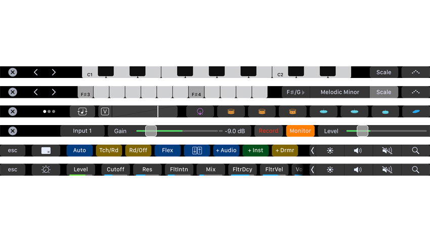
That situation becomes even more laughable when you discover that drums mode - which replaces the keyboard with drum pads for Logic's Drummer, Drums Designer, Drum Machine Designer and Ultrabeat instruments - includes a dedicated slider for free adjustment of velocity! We can only assume that the keyboards will get the same thing at some point, hopefully accompanied by pitchbend and mod wheel controls.
Get the MusicRadar Newsletter
Want all the hottest music and gear news, reviews, deals, features and more, direct to your inbox? Sign up here.
The discrepancy between the keyboard's octave up/down buttons and drums mode's single 'pad bank up' button is weird, too, but drums mode's Note Repeat slider, for working in variable-speed rolls in real time, MPC style, is ace.
Latency-wise, the keyboards and drum pads perform surprisingly well - more than adequately for basic auditioning, noodling and note entry. You do get the odd lagging note, though, most notably when the Touch Bar goes untouched for a couple of seconds, after which the first note played arrives very late. A bug, we presume.
Taking shortcuts
In shortcut mode, the Touch Bar transforms into a multi-bank array of eight key command-replicating buttons, with banks toggled using the Shift, Control, Option and Command modifier keys. Every bank is fully editable, but the default setup places transport controls on the unmodified bank; the mouse pointer tools palette on the +Alt bank; region moving, splitting and joining functions in the +Cmd bank; track creation, automation and Flex controls on the +Ctrl bank; and a diverse grab bag on the +Shift bank -Colors palette, Tuner, Selection-Based Processing, Event List, Note Repeat, etc.
The default assignments are sensibly thought-out, but any shortcut button can be changed to the key command of your choice in Logic's Key Commands editor. Every possible combination of the four modifier keys opens its own bank, as well, so you've got 11 empty banks to populate as you see fit.
To assign a button, simply find your desired shortcut in the Key Commands list, hit the Learn Touch Bar button, hold down one or more modifiers (or not) and tap your Touch Bar button of choice. The shortcut is added to the Touch Bar in the specified bank and the assignment is entered into the Key Commands list. You can then give the button a short name and one of seven colours.
Also, just as it does with keyboard shortcuts, the Key Commands editor lets you set up individual Touch Bar shortcuts to do different things depending on which editor or window you're working in. You could have a shortcut assigned to 'Create Track Stack' when in the Main Window and 'Create New Auxiliary Channel Strip' when in the Mixer window, for example.
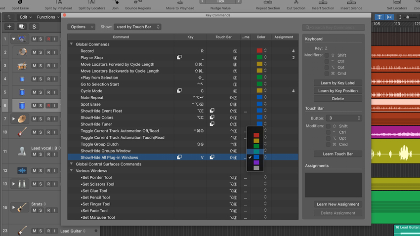
Logic's extensive key commands system has always been one of its greatest workflow-related strengths, and the transposition of it to the Touch Bar is as successful as we could imagine it ever being without the addition of haptic feedback. Obviously, in terms of tactility and muscle memory, it's a big change, and having to look away from the screen to execute shortcuts that we know we could fire off on the keyboard with our eyes shut is certainly taking some getting used to.
Nonetheless, we can already see that committing a small set of modal key modifiers to memory for invoking related sets of graphically represented shortcuts, rather than learning a ton of disparate key commands, could conceivably be the easier and perhaps 'better' way, particularly for newcomers to the software.
Bar humbug
All in all, we're very impressed by how effectively Apple has integrated the Touch Bar into Logic Pro X. Navigation mode is totally intuitive, the Smart Control mode is fantastic, the keyboard Scale mode is every bit as helpful as its equivalents in Ableton Push, NI Komplete Kontrol et al, and the handling of shortcuts is quite brilliant.
We're surprised there's no mixer mode, though - we were expecting to be able to switch through banks of level faders, pans, sends and mute/solo buttons. And, as mentioned, we're absolutely flabbergasted by the fixed-velocity keyboards - a velocity slider had better be at the top of the to-do list.
"We're surprised there's no mixer mode, though - we were expecting to be able to switch through banks of level faders, pans, sends and mute/solo buttons."
There's also a minor issue with the OS X Control Strip. The keyboard, drum pads and recording panel all extend across the full width of the Touch Bar, 'overwriting' the Control Strip, but the arrangement view and Smart Controls don't, requiring it to be disabled if you want to maximise the space available to them. It's an awkward inconsistency.
Shortcut mode won't extend beyond eight buttons, either, even with the Control Strip turned off in System Preferences, but we can go with Apple on that one, as the positioning of shortcut buttons should be persistent, regardless of what the rest of the Touch Bar is doing.
'Version 1' teething troubles aside, as it stands, yes, Logic Pro X 10.3 does indeed make the MacBook Pro Touch Bar useful for musicians. We're looking forward to seeing where Apple takes it next, and what ideas and workflows other DAW developers might bring to the table, because there's clearly plenty of potential in that wacky OLED strip.
A music and technology journalist of over 30 years professional experience, Ronan Macdonald began his career on UK drummer’s bible, Rhythm, before moving to the world’s leading music software magazine, Computer Music, of which he was editor for over a decade. He’s also written for many other titles, including Future Music, Guitarist, The Mix, Hip-Hop Connection and Mac Format; written and edited several books, including the first edition of Billboard’s Home Recording Handbook and Mixing For Computer Musicians; and worked as an editorial consultant and media producer for a broad range of music technology companies.
