MusicRadar Verdict
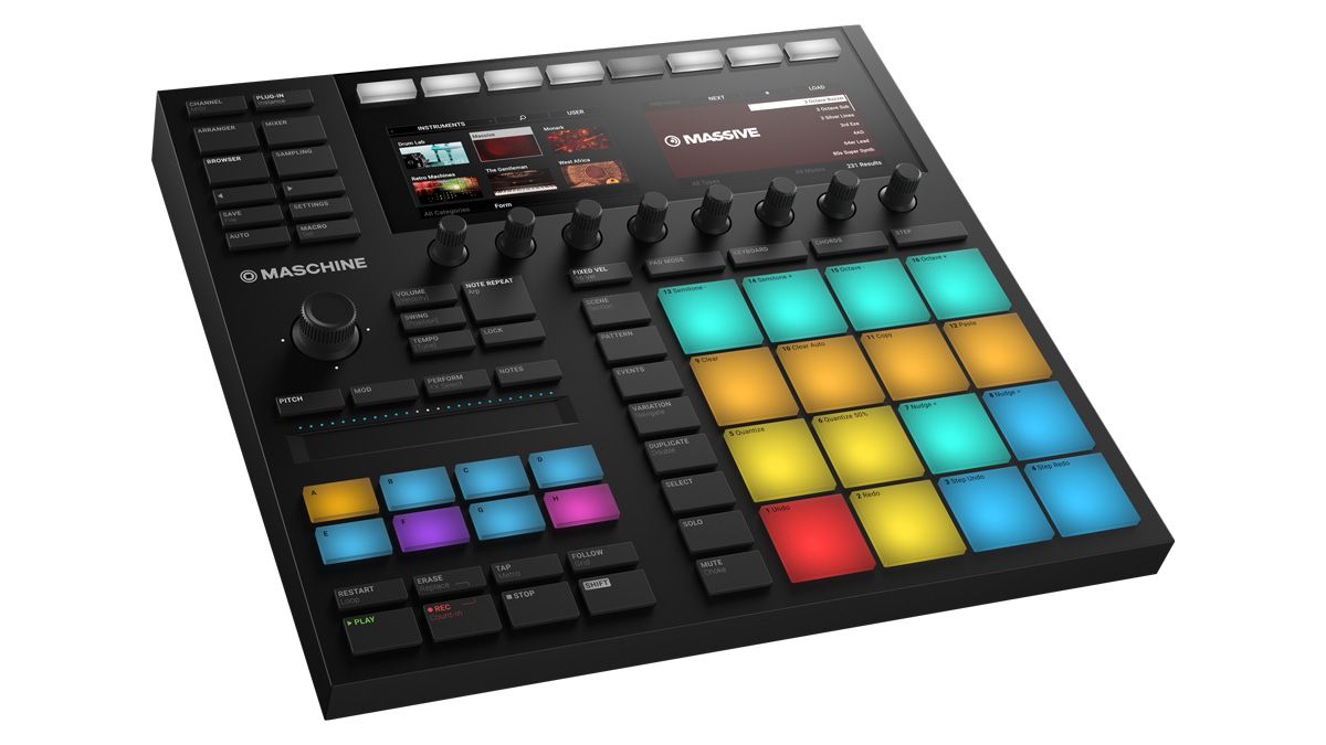
Maschine Mk3 takes the essence of Maschine Studio, adds an audio interface and touchstrip, and packs it all into the optimal form factor for stage and studio.
Pros
- +
Maschine Studio’s colour screens!
- +
Supremely playable pads.
- +
All-new audio interface and touchstrip.
- +
Stunning build quality and looks.
Cons
- -
No back legs for angling.
- -
4D push encoder isn’t mixer-friendly.
MusicRadar's got your back
In the eight years since Native Instruments first introduced its MPC-inspired hybrid hardware/software beat production studio, Maschine, the platform has become kind of…complicated.
The software - which is the same no matter which hardware is connected to it - stands at version 2, but for about a year now, the controller line-up has consisted of four models: Maschine Mk2, Maschine Mikro Mk2, Maschine Studio and the conceptually distinct Maschine Jam.
Each ofthe last three has its own particular ‘angle’ - Studio’s luxurious control surface and high-res colour screens, Mikro’s portability, and Jam’s 64-step sequencing - with the regular Maschine Mk2 sitting amongst them as the most ‘universal’ model, with its compact yet comprehensive design.
Maschine Mk3 wants to change all that, bringing Maschine Studio’s ¬lagship feature – its fabulous screens - to the mainstream model, taking a couple of cues from Maschine Jam, and updating the hardware in general terms. We’d guess there’ll be a Maschine Studio Mk2 at some point, and hopefully a Mikro Mk3, but that’s entirely speculation on our part.
In this review, we’re only going to be looking at what’s new in Maschine Mk3. If you’re unfamiliar with Maschine in general, check out our previous reviews.
Colouring in
Maschine Mk2 made minimal changes to the layout and construction of Mk1, but Maschine Mk3 is a total redesign. We never had any issue with Mk2’s build quality, but Mk3 takes the device’s physicality to new heights, its all-metal construction, sturdy knobs and firm, clicky buttons putting it right up there with Ableton’s Push 2 - the current controller construction benchmark.
It’s 0.25" longer than Mk2, an inch shallower at its deepest, and weighs 0.4kg more. The LED backlit buttons have been overhauled: all but the Group and top-row function buttons are now solid black with cutout lettering allowing the light through. This gives the whole unit a much classier appearance, making the buttons on all other Maschines look comparatively chunky and toy-like.
Like Mk2, Maschine Mk3 is USB bus-powered - an impressive achievement, given that it not only incorporates two full-colour screens but also an audio interface (see Wired for sound). A power supply is included, for ramping up the brightness of the LEDs, should their bus-powered maximum not be enough. Oh, and there’s a power button now, so you can turn it off without unplugging it. About time, too.
Sadly, however, Maschine Mk3 still doesn’t have fold-out legs for angling it to suit seated desktop use - only Maschine Studio gets that embellishment.
It’s been a notable omission since version 1 of the hardware, but finally, NI has taken the obvious step of building an audio interface into Maschine. Not only does this give those working in small home studios - perhaps with Maschine and an audio interface as their only pieces of external hardware - the option to claim back a bit of desk space.
More importantly, though, it means live performers now have one less box to lug around. The interface itself is nothing remarkable, being a simple 2-in/4-out setup capable of recording and playback at up to 24-bit/96kHz quality, and appearing as a regular audio interface in your operating system and applications, including, of course, Maschine 2. The requisite quarter-inch jack sockets are all located on the back panel: Left and Right TRS Line Ins, Left and Right TRS Line Outs, a dynamic Mic In (there’s no phantom power, and this overrides the Left Line In when connected) and a headphone output. Small volume and Gain knobs sit alongside them.
Audio quality is great, and on our test Mac, we got round trip latency as low as 4.24ms at 32 samples, 7.87ms at 128 samples, and 25.3ms at 512 samples. The headphone out goes very loud indeed - good news for on-stage usage scenarios. As you’d expect, the established 5-pin MIDI In/Out ports and quarter-inch Pedal input are still in place, too.
Clearly, the biggest single change made to Maschine for Mk3 is the addition of those big, colourful dual displays: a massive upgrade from Mk2’s narrow, monochrome dot matrix screens. Previously the sole preserve - and a major selling point - of Maschine Studio, these are essentially the same 480x272-pixel LED jobs, but with lower power requirements and better viewing angles that go some way to alleviating the aforementioned perpendicular usage issues.
As with Studio, the new displays bring numerous elements of the software to life directly on the hardware in all their full graphical glory, including the browser, the mixer, the Plug-in Chains, the arrangement, Scenes, and the Pattern and Sample editors.
Yes, you can edit and step sequence MIDI in the piano roll using just the screens, knobs and pads; and although it’s never going to be as quick as using the mouse, the system as a whole absolutely works.
While Mk3’s tarted-up screens don’t reveal a transformative new layer of functionality (by and large, they visualise the same things operated by the knobs and buttons above and below as their equivalents on Mk2), they make that focal window onto the Maschine software infinitely prettier and more informative than before.
Now you really can get pretty much everything done without looking at your monitor or touching the mouse if you really want to. And as any Maschine Studio user will attest, once you’ve used them for ten minutes, you simply can’t go back.
On the buttons
Every new version of Maschine fires up debate among the, er, finger-drumming community when it comes to the all-important pads, which NI naturally claim to have improved with each iteration. Mk3 will be no exception, but these are certainly our favourite Maschine pads yet.
Significantly more sensitive than those of Studio and Mk2, supremely consistent and increased in size but not centre-to-centre distance, they feel more spacious and responsive than ever. While the larger pads mark a minor tweak to playability, the new button layout realises a complete recalibration of Maschine’s workflow that, after a period of adjustment, proves profoundly effective.
For starters, the three main pad modes - Pad, Keyboard and Step - are now switched using a row of buttons above the pads themselves, rather than the random positions of old, with the Chords button activating the Scale and Chord engine.
Beyond that, the layout changes comprise a combination of Maschine Studio-inspired repositioning (the Control Section buttons - Channel, Mixer, Plug-in, Arranger, Browser and Sampling, doing away with the now-redundant Control button), and the relocation of several previously Shift-operated functions to their own dedicated buttons: Fixed Velocity, Events and Lock/Extended Lock, the last simplifying access to Maschine 2’s superb new snapshot morphing.
There are a handful of all-new buttons, too: File/Save, for opening, saving and copying projects, arrangement/pattern Follow, Tap Tempo, Settings (metronome timing and volume, count-in time, etc), and the Smart Strip modes - see Strip Club.
The Note Repeat button has been increased in size in response to user feedback, making it easier to hit in the heat of the moment. A valid change, but it’s still too far away from the pads, and we’ve already found ourselves coming very close to hitting the Lock button immediately below a few times. It felt safer with more empty space around it.
Mk3 adds a new physical control interface to Maschine in the shape of the horizontally positioned Smart Strip. Lifted from Maschine Jam (which boasts eight of them), this is a versatile ribbon controller with a multi-segment LED ladder for visual feedback, that switches between four modes of operation via the buttons above it.
In Pitch and Mod modes, the Smart Strip simply emulates a pitch or mod wheel, but with the advantage of being able to jump instantly between values by tapping. The lack of wheels on Maschine has always been a minor limitation, and the Smart Strip solves it elegantly, although it would be even better with a ‘snap back to zero’ option for Mod mode. Perform mode assigns the Smart Strip to the Perform FX module for the current Group - if there isn’t one loaded, pressing Shift+Perform calls one up.
The parameter controlled by the Strip depends on the Perform FX Mode - cutoff Frequency for the Filter, Position for Tremolo, etc. In Notes mode, the Strip is used to ‘strum’ sounds. With Maschine Mk3 in Pad Mode, running a finger left and right sweeps through the sounds of all held pads, or the whole Group if no pads are held.
With Maschine in Keyboard or Chord modes, it sweeps up and down the keyboard, again only playing the notes of held pads, or all of them if none are held. Notes and Perform modes are a lot of fun, but its in Pitch and Mod modes that the Smart Strip proves most useful.
Overall, though, the new layout is a triumph, simplifying mode switching, editor access and more. The only things missing in comparison to the expansive Maschine Studio are the dedicated Edit section (relieving the pads of their Shift functions) and the jogwheel - although the latter might actually be preferable to Mk3’s most controversial new feature: the four-directional push encoder.
Replacing Mk2’s multifunction knob and left/right buttons, this seemingly forward-thinking new controller merges a four-way joystick, a knob and a button, for, primarily, navigating the browser, operating the mixer, and adjusting master Volume, Swing and Tempo.
In Mixer mode, nudging left and right steps through channels, up and down switches between Groups and Sounds, and pushing toggles the knob between volume and pan control. It’s a good idea in principle, but the joystick element just isn’t as precise as good old-fashioned buttons.
Expect to find yourself accidentally changing channel when you mean to step back a level occasionally - a bit annoying. More successful is the enhancement of the eight rotary encoders with touch-sensitivity, again á la Maschine Studio. Simply touch a knob to call up category lists in the browser and plugin control submenus, and instantly assign its parameter to a Macro Control.
The magic number
Maschine Mk3 represents the pinnacle of the series thus far - effectively Maschine Studio squeezed into a smaller case, with an audio interface and touchstrip rolled in, and a layout optimised for the software in its current form.
For Maschine Mk2 owners, it’s a fantastic if not essential upgrade. The fabulous displays still look like ‘the future’, the Smart Strip is well worth having, and the iterative refinements throughout feel like a substantial evolutionary progression.
You might not make better music with it than you already do with Mk2, but the process will be noticeably smoother and much more eye-pleasing. Ultimately, Maschine Mk3 is the best controller for NI’s groove workstation yet.
Computer Music magazine is the world’s best selling publication dedicated solely to making great music with your Mac or PC computer. Each issue it brings its lucky readers the best in cutting-edge tutorials, need-to-know, expert software reviews and even all the tools you actually need to make great music today, courtesy of our legendary CM Plugin Suite.

“What is this garbage?”: 25 years on, Nick Cave has made his peace with the Red Hot Chili Peppers and reveals what happened when Flea came face to face with a bear…
“There is no one who can do this process with me as well as he can”: Alex Van Halen says he is working with Steve Lukather to complete a new Van Halen album

“Playing the parts of one of my favorite guitarists ever is no easy task, but it was a joy”: YouTuber Ben Eller thanks fans and his Mastodon bandmates after stepping in to replace the departed Brent Hinds at the last minute
